It's Broken Again?
A website that enables users to make informed dining decisions.

PROCESS HIGHLIGHTS
Design challenge & responsibilities overview
Challenge
Design a solution that encourages people to actively engage and contribute to information sharing.
Opportunity
Create a social-media platform that provides food stock updates and enhances customers' dining experiences.
Project Type
Academic Project
Role
UI/UX Designer
Product Designer
Contribution
UX Research
UI/UX Design
Product Design
Prototype
Team
Christine Chen
Anna Martinez
Andrew Mclenney
Jonathan Xu
Tools
Figma
Wix
Timeline
3 Months
Oct. - Dec. 2019
BACKGROUND
Solving a Real-World Problem Around Us
To address a common frustration for food consumers, my team developed "It's Broken Again?" as a solution to the frequent unavailability of items at restaurants. Whether it's a perpetually broken McDonald's ice cream machine or the disappointment of finding Popeyes' chicken sandwiches sold out, customers often face frustration due to equipment malfunctions, supply shortages, or other unexpected issues.
Our website empowers users in the University of North Carolina at Chapel Hill (UNC) community to share real-time updates on product availability at fast food locations. By providing this platform, we aim to prevent wasted time and disappointment, promote transparency in the industry, and ultimately enhance the dining experience for everyone. Additionally, our solution helps businesses optimize inventory management and build customer loyalty.
RESEARCH
User Survey
To learn more about the dining experiences of the UNC community and identify user needs and pain points, I designed and distributed a survey to over 300 students and faculty, and received 214 responses in total.
I identified the following pain points from the survey results:
Difficult to Search for Information
People struggled to find food availability information due to the lack of a dedicated platform, leaving them unsure where to look.
Unreliable & Inaccurate Information
The lack of validation for online comments makes it difficult for people to trust food availability information. Traditional methods, like calling the restaurant, are not always reliable due to potential delays in response.
DEFINE
Problem Statement
After researching our target audience experiences and challenges, our team crafted a problem statement that captures the key issues to address.
“How can we create a centralized platform that offers easy access to accurate and verified information about food availability updates?”
DEFINE
User Persona
While our survey participants were primarily college students, our platform is designed to benefit a broader audience, including local residents and visitors. I created two primary user personas: a UNC student and a restaurant manager. These personas helped us design a platform that addresses key challenges, aligns with our objectives, and considers the needs of other potential users.


IDEATE
Developing a Solution
Our primary goal was to develop a centralized, user-friendly platform that provides accurate and clear information about food availability at local restaurants.

Accurate
Provide up-to-date & correct information

Centralized
Cover various restaurants on a single platform

Clear
Develop a text-based platform

User-Friendly
Create a streamlined & understandable interface
IDEATE
User Flow Diagram
After developing the goal of our solutions and key user personas, I created a user flow diagram to map out how users would navigate and interact with "It's Broken Again?". This visualization helped identify any potential usability issues and optimize user engagement and experience.

IDEATE
Mid-Fidelity Prototype
I developed a mid-fidelity prototype in Figma to visualize our concepts. Given that most users access platforms via mobile, we opted for a website over an app to ensure broad accessibility. User survey insights revealed a preference for social media engagement, and platforms like Yelp and TripAdvisor demonstrated the value of business-consumer interaction. Thus, I designed a text-based website with social features, enabling users to find and share food availability information easily.

DESIGN
Final Product
I developed interactive prototypes using Wix to effectively showcase the design goals and products for a class presentation. With most users expected to access the site via mobile devices, the demonstration emphasized the mobile version’s functionality and user experience.
1. Access to timely information
-
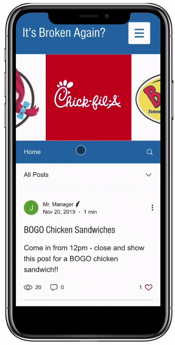
Posts on the home and category pages are sorted by newest submissions.
-
A drop-down menu with tabs for posts, managers, and partnered restaurants is included on all pages except sign-in/sign-up, ensuring easy access to current content.
-
A search bar above the menu enables quick searches for food items or ingredients.
-
Partnerships with fast food chains provide users with timely updates from managers.
2. Foster a sense of trust and reliability
-
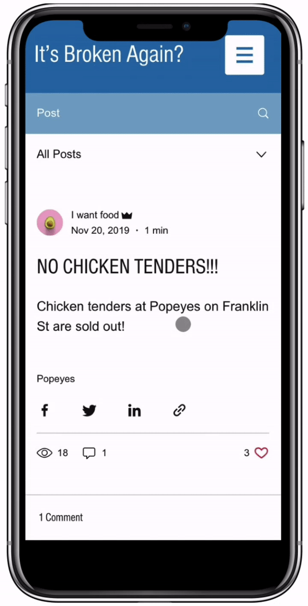
To address ghostwriting, the platform requires user registration and authentication for posting and commenting.
-
To assist managers with oversight, they’ll receive notifications for new posts and can review them by adding comments.
-
Managers can also share posts, offering updates on food availability to help set customer expectations and enhance their experience.
3. Social Media Platform Features
-
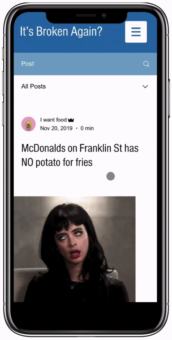
Signed-in users can share thoughts and feedback by commenting at the bottom of the page.
-
All users, logged in or not, can show appreciation for a post with a single click on the 'heart' button.
-
To broaden visibility, users can also share posts across other apps or platforms.
4. Driving Participation with Benefits
-
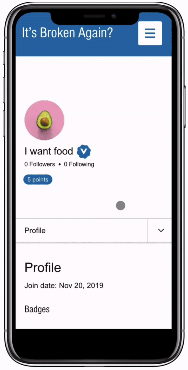
Our platform encourages user engagement by rewarding verified posts with redeemable points for discounts.
-
For managers, it enhances customer perception and dining experiences by delivering essential information for informed decisions, minimizing frustration from unavailable items.
-
A strategic slideshow on the homepage and category pages also provides restaurants with a powerful tool to promote campaigns and advertisements effectively.
REFLECT
Conclusion
This 3-month group project was a collaborative and rewarding experience. Our team worked together effectively to conduct research, design, and integrate various components, resulting in the creation of a user-friendly and efficient website. Throughout the project, open communication and task allocation were crucial in ensuring our success. Personally, I had the opportunity to hone my UI/UX design skills, while strengthening my product design and problem-solving abilities.
Due to the in-class project's contraints, we regrettably could not conduct user testing. Looking ahead, I am eager to explore user testing methods for future projects. By incorporating user feedback and insights, I aim to make more informed design choices and continually improve my UI/UX design abilities.